views
- Place an image, title, and your name on the front outside panel. Write a 3-5 sentence paragraph briefly introducing your topic on the first inside panel.
- Write about a separate subtopic on each inside panel. Use short sentences or bullet points that your reader can skim easily.
- Summarize your topic on the back page of your brochure. Remind the reader of your main points, then list citations and suggestions for further reading.
Organizing Your Brochure
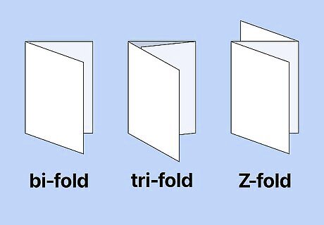
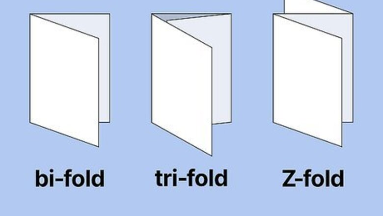
Choose a fold type for your brochure. There are three main types of brochures: the bi-fold, the tri-fold, and the Z-fold. Tri-folds are the most common type of brochure used for school projects, as they allow you to include plenty of information and helpful visuals. If your teacher didn’t specifically tell you to make a tri-fold brochure, you could try the bi-fold or Z-fold. Choose the bi-fold for simple and minimalistic content. The bi-fold is clear and easy to read, but there’s less room for detailed information since there are only four panels. Choose the Z-fold for a more unique and eye-catching design. The six panels of this style fold out like an accordion, so it’s a good choice for sequential information. Before settling on your fold-type and layout, sketch out your basic outline on a plain piece of paper and try folding it to make sure the information flows logically.
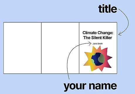
Add an image and title to the front panel. This is the panel that will be visible to your reader when the brochure is closed. Choose a short and punchy title and place it in the center of the panel with your full name underneath. Add a picture that’s relevant to your overall topic. For a tri-fold or bi-fold, this panel is the rightmost panel when the paper is laid out flat in front of you. For a z-fold, it’s the leftmost front panel. For a brochure about climate change, you could go with a straightforward title like “Climate Change” or something attention-grabbing like “Climate Change: The Silent Killer.”
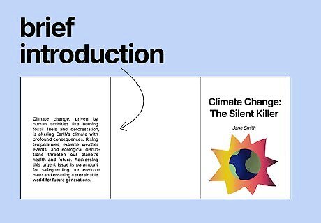
Provide a brief introduction to your topic on the front interior panel. Write a 3-5 sentence introduction to the subject of your brochure. Your introduction will set the stage for the rest of the brochure and help the reader better understand the information they will be given. For a bi-fold, this panel is on the backside of the front panel or cover. For a tri-fold, this is the leftmost panel on the same side of the paper as your cover. For a Z-fold, it’s the middle panel directly to the right of the front panel or cover. An introduction to a geography brochure on the Maldives might say something like this: The Maldives is a country in Asia located south of India and Sri Lanka. It is made up of a chain of 26 small islands. The Maldives' sunny, tropical climate makes it a popular getaway for vacationers worldwide.
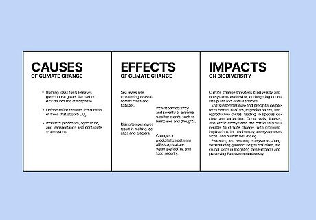
Use each remaining interior panel to discuss a subtopic. Write about a different subtopic on each inside panel and present details that pertain to your main topic. Write in short sentences or bullet points to make it easier for your reader to follow along. For a brochure about dietary nutrients, you might talk about proteins on one panel, fats on another, and carbohydrates on the final one. In some cases, the amount of information you have to discuss will determine how many pages your brochure will be. A bi-fold brochure will only have one remaining interior panel, while a tri-fold has three and a Z-fold has two. On a Z-fold, you can also use one of the back panels for additional information.
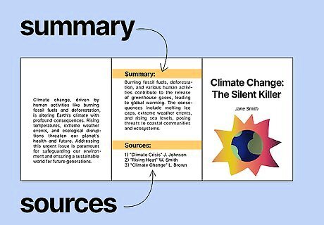
Summarize your topic on the back page of your brochure. End your brochure by offering your reader a quick recap of the most important points you covered in the preceding panels. Use simple, direct language to clear up any confusion they may have about what they've just read. Cite the sources you used to do your research and add them to the back panel. You can also add suggestions for further reading on the topic. A good rule of thumb is to include at least one key detail from each interior panel in your summary on the final panel. For a bi-fold, tri-fold, or Z-fold, the back panel will be on the same side of the paper as your front panel or cover.
Designing Your Brochure
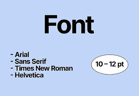
Use small and legible fonts for your body text. Choose a common typeface like Arial, Sans Serif, Times New Roman, or Helvetica. Set your font size between 10 and 12 so your content is easily readable and skimmable. Enlarge the text slightly for headings and titles. Avoid using elaborate or loopy fonts that may be difficult to read. If making a brochure by hand, print your letters rather than writing them in cursive. Write neatly in tidy handwriting that anyone can read.
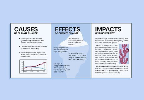
Incorporate pictures and other graphic elements throughout. Use images that are small but high-quality and easy to see. Place your images on one side of the page near the margins and format your text around them to make the best use of the space you have. Pictures are useful for breaking up big chunks of text on the panel and giving your reader something interesting to look at. They work best when they accompany an important piece of information. Avoid adding more than about 2 pictures per page. Too many can quickly become distracting, resulting in a cluttered, amateurish look. Remember that you'll need to provide citations for the images you include to let your reader know where you found them. Write these citations on the back page of your brochure.
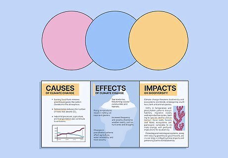
Use color to add style and emphasis. Make your title and headings a different color than your main text to create contrast and signal to your readers that they're encountering something new. Outline your images or add a colorful border to your brochure. You could also include full-color pictures for more vibrant detail. Or, you can print or draw colored paper in a light shade that doesn’t clash with your lettering. You can easily change your font color using the text editor tools in your editing program of choice. If you're creating your brochure by hand, grab some colored pencils or markers for when you want to add a little flair.Tip: Try to limit your palette to about 2-3 colors so the design doesn't become overwhelming or distracting.
Assembling Your Brochure Digitally or By Hand
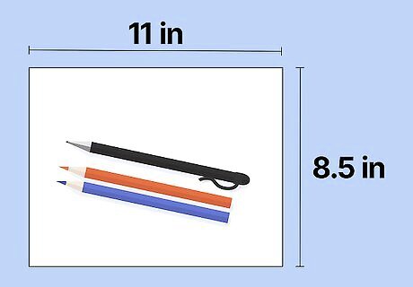
Make your brochure by hand using heavy paper and basic art supplies. For the brochure itself, start with a sheet of typing or construction paper that's at least 8.5 in (22 cm) x 11 in (28 cm). Write your brochure information with a permanent black ink pen, then use colored pencils or markers for borders, pictures, and other stylistic accents. Glue on images you’ve printed from the internet or cut out from a magazine. Or, draw relevant images directly onto the paper. The paper you're using should be thick enough to hold up to folding and big enough to be easily readable.
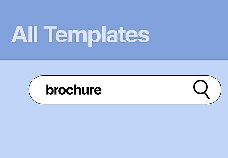
Create a brochure on the computer for a digital option. Open Microsoft Word on your laptop or desktop computer. Select File → New. Type “brochure” in the Search All Templates box and hit Enter. Choose a brochure style you like and click Create to open the template as a new Word document with pre-loaded text boxes and visuals. Select any text box and enter custom text with information about your topic. Change the font size, color, and type based on your preferences. Replace the sample images by right-clicking and selecting Change Image. Find a picture you’ve saved to your computer and click Insert. Change the color scheme or add more design details using the Design tab. If you have an Apple computer, the Pages application has similar templates and design process for brochures.Tip: You can also create brochures with InDesign, Adobe Photoshop, Canva, Scribus, Lucidpress, and Inkscape. All of these online programs have a variety of digital templates to create and customize your design.
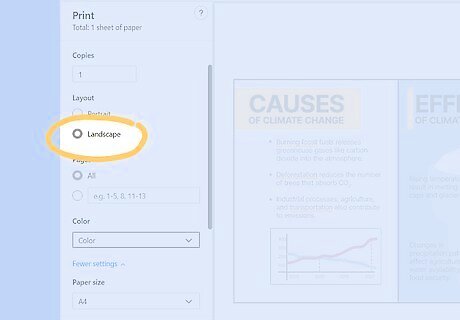
Print your brochure, if applicable. Proofread your text for spelling and grammar errors and make sure all your images are properly formatted. Make sure that no piece of content overflows from one panel to the next. Select the Print option and print your brochure double-sided and in landscape format.

Fold your brochure according to your chosen fold type. Find a flat and stable surface clear over other items to fold your brochure. Always start with your paper in landscape orientation, and always double-check that all the edges of the brochure align before firmly creasing the fold with your fingernail. Bi-fold: Fold the paper in half directly down the middle. Both panels should have the same width, which is about 5.5 inches (140 mm) if using a standard piece of printer paper in the United States. Tri-fold: Fold the right edge of the paper over the left until it covers half the remaining sheet. Fold the left edge of the paper over and crease so that your paper is divided into equal thirds—each panel should be about 3.6 inches (91 mm) wide. Z-Fold: Fold one end of the page inward until it’s one-third of the way across the width of the paper. Fold the other end of the sheet in the reverse direction until it aligns with the opposite edge on the back of the sheet. If you made your brochure using a digital template, it should have indicated lines for you to fold on—but make sure to fold directly on the line so your reader doesn’t see it!






Comments
0 comment