views
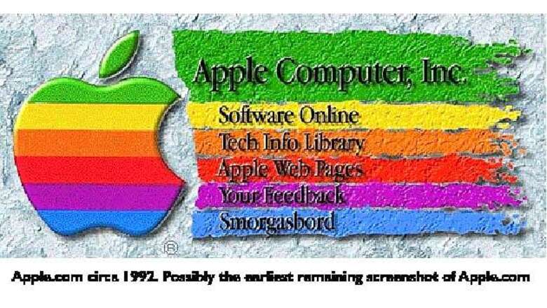
New Delhi: An Apple curator has posted on Web what is believably Apple Inc's earliest recorded home page from way back in 1992- one that is tiny and pixilated.
When Kevin Fox wasn't happy with a blog post that claimed to show screenshots from the early days of Apple homepage, he himself took the charge to hunt down the memory lane and post his version of the earliest mirror of Apple.com, captured shortly after the Wayback Machine went live.
Apple Inc, as we know today- a tech giant, bringing in highly sophisticated products for consumer and business needs, was once a company whose homepage was so tiny, pixilated, and as Fox notes in his blog- more Fractal Design Painter and less grids and columns.
Fox dug down like an archaeologist to the proper level and sifter through the file hierarchy, which in this case was an archive of a backup that had been burned to CD-R in 1995. When he was still not able to locate the file, he went hunting the Scrapbook- one of many Desk Accessory apps that was sort of a super-clipboard where you could paste items and page through them later like a scrapbook.
After treating the file using Photoshop and GraphicConverter, the image was extracted. It was tiny, which fitted the computers of the yester years that included the Mac Classic II that had a screen of 512 by 342.
The homepage had no real text as it was one graphic unit with text burned-in. It was truly pixilated in a time when 'web safe colors' actually meant something and most color monitors displayed only 256 colors. The page actually had bevels and drop-shadows in the logo, unlike the modern-day flat, crisp, no-nonsense appearance.
Navigation on the page was via a server-side imagemap. You had to click on the image and the browser would then send the x and y coordinates of the click to the server, which would use them to decide what URL you should be directed to and send a redirect.
In that age, when Internet was nascent, you couldn't even put text on the same row as an image. There wasn't any option for search with a text field in HTML. Browsers had a native Search box that would send a search request to a URL defined by the page, if the page supported search at all. Instead of search engines, Gopher or Usenet were used than the web searches.
Fox used few screenshots of NCSA Mosaic and reconstructive photoshopping to replicate how the homepage would have looked on a Mac Classic.


Comments
0 comment