views
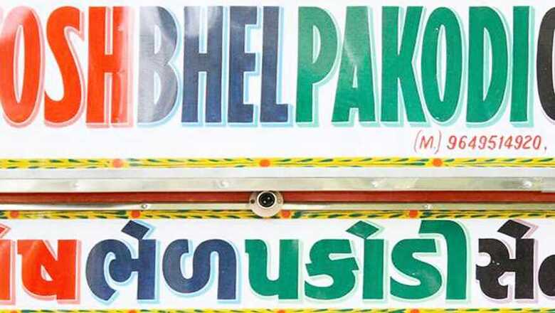
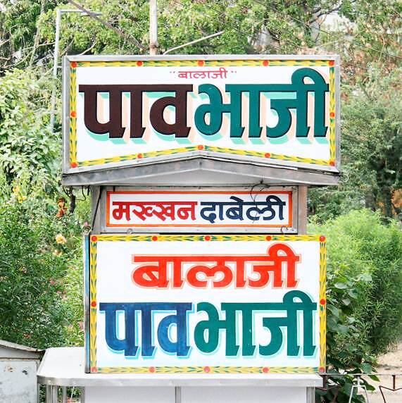
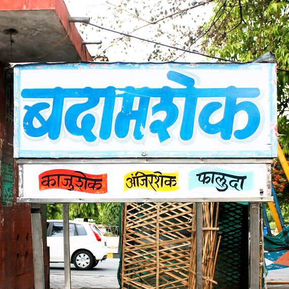
At a glance, Pooja Saxena’s Instagram feed resembles a particularly colourful alphabet book for toddlers. A bright dramatic ‘U’ in Superman colors or a curly ‘N’ that may have been made of a string of twinkly lights -- they all look a little arbitrary until you read the captions accompanying those alphabets and realize that each of these letters are insignia for a shop sign that she had encountered and loved in her life.
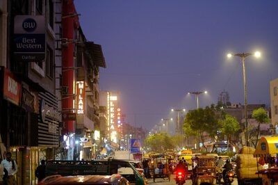
“Most people will walk down a street and not notice any public lettering; they might even read it for information and not notice what the sign looks like. That is the very opposite of my experience,” said Saxena.
Saxena is a typeface designer which in simple words means that she designs various families of fonts. Therefore, it is her job to pay attention to lettering. However, speak to her for five minutes and it’s obvious that she has a genuine passion for typography. Saxena said that on most days, she pay attention to letterforms on signs, and she is intrigued by them. “What material are they made of? Are they printed or hand-painted? What language and script are they in? How old are they? What kind of colours or illustrations do they use alongside text?” are the questions that instantly pop up in her head.
A truth that we often ignore is that we are all surrounded by a hyper-reality of texts. From our digital sphere to the real world, our lives are inundated by words on a regular basis. Whether an individual is reading a book, a menu, a magazine or an article on his phone, or navigating through the city streets, he is bound to encounter thousands of words and yet, he seldom registers them mindfully. Therefore, Saxena, through a recent project called India Street Lettering is trying to bring the creative and original works of Indian sign-makers to people’s attention.
She started the project as a blog called Bangalore Letters, where she archived and documented interesting street signs of her city, Bangalore. However, the project soon surpassed geographical boundaries and the typeface designer has since then been sharing unique shop signs online.
“Since last winter, I have also run three sold-out ‘type and lettering walks’ in Delhi’s Paharganj. These walks have been a natural extension to my desire to document street lettering. To take people to where the signs really are and help them place these signs in their contexts is very helpful in making others appreciate them. We talk about stories of culture, language and history, and how signs impact how we experience our cities and neighbourhoods,” said saxena.
Saxena isn’t the only Indian typeface designer who is trying to draw public attention to letterforms and typography. In fact, it is now a trend to make typography cool and capitalize on it. From quirky road signs being the latest addition to living room décor, to unconventional lettering showing up on tote bags and cushions covers, interesting typefaces are suddenly the centerpiece of hipster aesthetic.
And while it is great that people are finally paying attention to typefaces and letterforms for its beauty, the truth of the matter is typography is far more influential than we realise.
How Typography affects us?
In 2017, a big faux pas happened at the 89th Academy Awards when presenters of Best Film category, Warren Beatty, and Faye Dunaway mistakenly announced La La Land as the Best Picture instead of Moonlight. The mix-up was attributed to two accountants of PwC who had unwittingly given the wrong envelope to presenters. However, Independent reports that a graphic designer, Benjamin Bannister, pointed out that the confusion could also have been avoided if the typographer who worked on Academy's paperwork was cautious enough to bold and emphasize the key text on the cards (instead of making all the texts of the same size).
While we seldom pay heed to the size, positioning, colour and spacing of any text, more often than not, they affect our choices to a great extent. As we register words on a conscious level, their typefaces or fonts affect our minds on a subconscious level.
Chances are we have already accredited a personality to each typeface, which we know from the menu of typefaces in Microsoft Word. For example, when we think of Comic Sans MS, which happens to be one of the most widely used typefaces in the world (much to the chagrin of typeface designers) we think of informal, playful comic book lettering, therefore, anything written in that font we often take casually and deem to be unimportant. On the other hand, Times New Roman automatically conveys gravitas and official-ness and is mostly used in books, academic journals and work-related communications.
"Typefaces can convey different meanings based on their style. People will find a serif font more formal than a font that emulates chalk-board lettering. Some typefaces emulate historical models and are perceived based on that. Why or what fonts become popular is a whole other can of worms," said Saxena.
Typefaces affect our moods, our reading rhythm and tells us how we feel about a certain text. Therefore, it becomes extremely important for typeface designers to understand what message the text at hand is trying to send out and then pick out the typeface accordingly. "The typeface needed for movie titles has different requirements than one needed for a newspaper or a magazine. But typefaces can be differentiated further from each other by situating them more specifically in the visual culture of a particular place or time, experimentation to fit letterforms in different media, paying attention to detail etc.," adds the typeface designer.
How Advertisers use different typefaces to their advantage in web, television as well as print media?
Advertisers are completely attuned to the psychology of fonts and use it to their advantage. Through typography they create their brand identity in a subtle but concrete way. Be it Coca Cola, IBM or YouTube, every big brand has a customized typeface of its own that reinforces its brand presence and gives it an understated marketing push. In fact, after being exposed to different brands over the years, we automatically come to associate certain kind of lettering, and colors with certain brands. Such is the power of typography.
In the digital world, where any content has just a few seconds to grab consumer eye balls, typefaces act as an important determining factor. “Typefaces have a huge role to play in the digital world, especially when it comes to Indian scripts,” said Saxena.
“The number of digital typefaces in Indian scripts continues to be limited as compared to what is available in the Latin script (in which we write English). As more Indians move to smartphones and start accessing the internet, without fonts in Indian scripts they will be forced to conduct their digital lives in English, which for many of them it is not their first, or even second language. If we have more typefaces in different styles and languages, then text can have different voices based on the content,” she added.
Saxena, who is already shinning a spotlight on the ingenious works of Indian sign-makers, is also creating new typefaces based on Devanagari. Her India Street Lettering project may be new, but it has been successful so far in veering public attention towards shop-signs.
“I do think people enjoy seeing photos and reading about the stories of interesting letterforms and signs. And if this makes them even a little more aware of these signs and letterforms when they are walking outside, I consider that a win.” Said the typeface designer.




Comments
0 comment