views
Tata Passenger Electric Mobility, a distinguished subsidiary of Tata Motors, has proudly revealed its revamped brand identity – TATA.ev.
The introduction of this new brand image demonstrates the homegrown automaker’s unwavering commitment to innovation, sustainability, and community development.
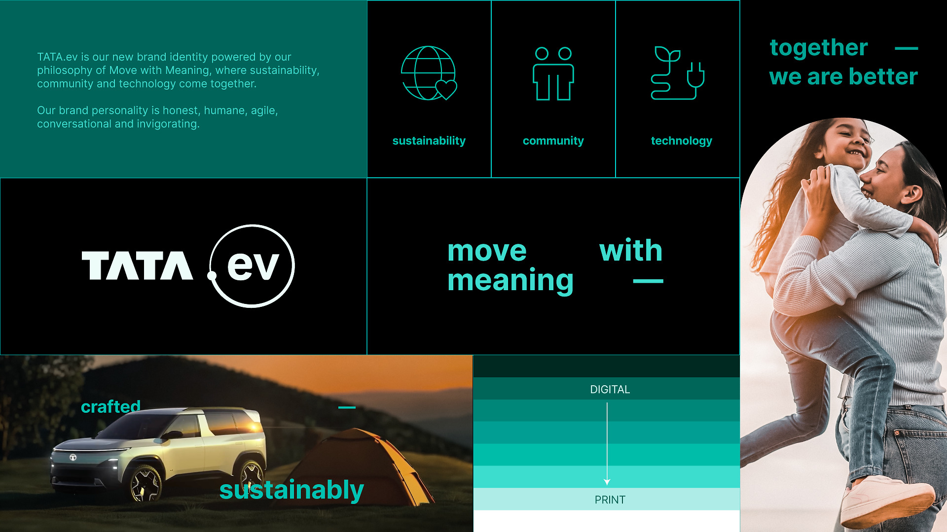
This identity integrates the principles of sustainability, community empowerment, and technology innovation. It is based on the theme “Move with Meaning.” It signifies the first step towards bringing customers unique and meaningful interactions and promoting a collaborative push towards an environmentally aware electric future.

TATA.ev: Core Aspects of the Brand Identity
Sustainability serves as the foundation of the brand identity for TATA.ev, which has been created in partnership with Landor & Fitch. Every design choice represents the brand’s strategic objective, with graphics that are accessible, open, and environmentally conscious.
- The Orbit: The “.ev” in the company’s logo is enclosed within an orbit. It represents TATA.ev’s role in promoting a circular ecosystem where people and the environment work together to create a better future.
- Evo Teal Color: The brand’s distinct Evo Teal color is a fusion of technology and sustainability, symbolizing innovation and a steadfast commitment to a sustainable tomorrow.
- Inter Typeface: The Inter typeface, known for modernity and accessibility, has been chosen to align with the brand’s sustainability-first approach.
- The Sonic Logo: The motion and sonic logo maintains a balance between tradition and innovation, infusing a sense of forward movement. It combines electronic circuits with a powerful ripple sound and is inspired by the intersection of nature and technology.
- Dynamic Typography: The introduction of the ‘bridge’ element in the typography injects movement and dynamism into the brand’s communication.
TATA.ev: Commitment to Sustainability
TATA.ev’s commitment to environmental responsibility is evident through several key actions:
- Eco-friendly Design: Print collaterals use reduced ink on a white base.
- Digital Efficiency: Digital collaterals follow a dark mode approach on a black base to minimize battery consumption and energy usage.
- Font for Sustainability: The use of the open-license and variable font family, Inter, enhances accessibility, optimizes performance, and aligns seamlessly with the brand’s sustainable ethos.
This refreshed brand identity will be progressively rolled out across consumer-facing communications, reaffirming TATA.ev’s dedication to a sustainable and dynamic future.
Under the banner of “Go Beyond,” the automaker has unveiled a three-phase EV strategy, designed to cater to diverse consumer needs through various body styles and accessible price points. The company’s focus on seamless connectivity, cutting-edge design, exceptional performance, and uncompromised safety across its EV lineup aims to set new industry benchmarks.


Comments
0 comment