
X
Research source
For beginners who need to understand what goes into a histogram and how to interpret it, here are some of the essential steps.
Reading Histograms
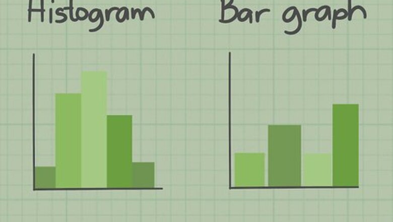
Recognize the difference between a bar chart and a histogram. Bar charts and histograms are similar, but with some very specific differences. A bar chart groups numbers into categories, while histograms group numbers into ranges. Histograms are generally used to show the results of a continuous data set such as height, weight, time, etc. A bar graph has spaces between the bars, while a histogram does not. A histogram often shows the frequency that an event occurs within the defined range. It shows you how many times that event happens.
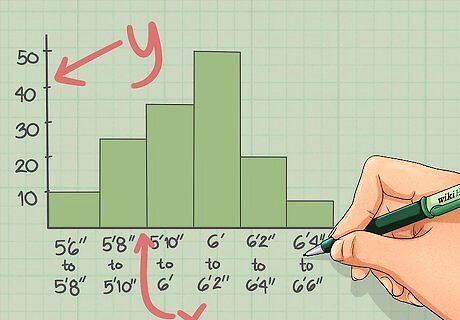
Read the axes of the graph. The x-axis is the horizontal axis and the y-axis is the vertical axis. Both give you essential information to reading the histogram. Many histograms show you the results of the frequency of an occurrence and will have a y-axis indicating frequency. The x-axis will tell you the ranges into which the data have been grouped. For example, a histogram detailing the frequency of heights of pitchers in professional baseball will have an x-axis of height and a y-axis of frequency.
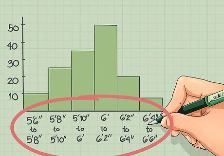
Identify the ranges used. The data is grouped into ranges or bins for graphing. Choosing the correct bin size is important in yielding a graph that will help you interpret your results. You want to choose ranges that are not too broad or too specific and allow you to see an underlying pattern of frequency in the data. For example, the average height of a professional baseball pitcher is 6’2”, but there will obviously be exceptions. Because the ranges of height will likely be between 5’6” and mid 6’6”, the bins should only vary by about an inch or two. Another note on the ranges: the very first group may range from 5’6” to 5’8”, but it does not include 5’8”. Each group includes everything up to the beginning of the next group.
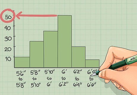
Use the top of the bar to read the frequency of that group. If you want to know how many times an event occurred within a specific range, simply look at the top of the bar and read the value on the y-axis at that point. For example, looking at the histogram, the number of players in the range of 6’0” to just under 6’2” is 50.
Graphing Histograms
Gather data to be graphed. If you want to gather data on the frequency of something, then graphing a histogram is a good way to look at your data. Whether you’re looking at the number of copies sold of a specific book or the weight distribution of cows on a farm, histograms are an easy way to get a broad picture of the overall pattern of the distribution of the data. EXPERT TIP Joseph Meyer Joseph Meyer Math Teacher Joseph Meyer is a High School Math Teacher based in Pittsburgh, Pennsylvania. He is an educator at City Charter High School, where he has been teaching for over 7 years. Joseph is also the founder of Sandbox Math, an online learning community dedicated to helping students succeed in Algebra. His site is set apart by its focus on fostering genuine comprehension through step-by-step understanding (instead of just getting the correct final answer), enabling learners to identify and overcome misunderstandings and confidently take on any test they face. He received his MA in Physics from Case Western Reserve University and his BA in Physics from Baldwin Wallace University. Joseph Meyer Joseph Meyer Math Teacher Develop strong graphing skills. Drawing graphs by hand will help you develop foundational graphing skills, especially in understanding scales and axes. This will build a strong base for you to use helpful online tools to visualize complex relationships, perform calculations, and prepare for standardized tests.

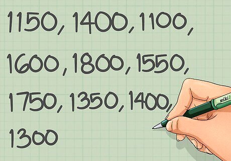
Choose your range bins. When plotting the data, you must first decide how you want to divide it up into ranges. You want to choose bins that will give you a good representation, so you don’t want them to be too broad or too specific. For example, let’s say you had 10 data points of the weight of cows on your farm: 1150, 1400, 1100, 1600, 1800, 1550, 1750, 1350, 1400, and 1300. These weights vary by hundreds of pounds, so you want your bins to vary by hundreds of pounds as well. Set bins every 200 pounds, starting at 1100 pounds going up to 1900 pounds. 1100-1300, 1300-1500, 1500-1700, 1700-1900 for a total of 4 bins.
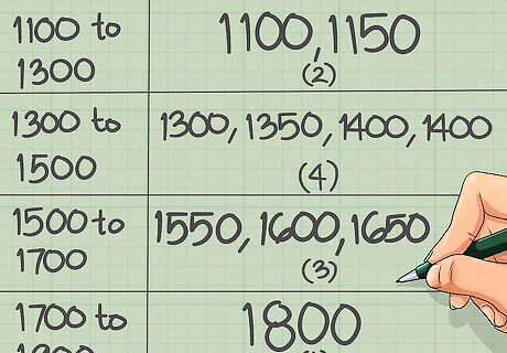
Separate the data into the bins. Once you have chosen your bins, you need to order and sort the data into these bins. Start by putting all of your values in ascending order. Then draw a line at the division of the bins. Count the number of values that fall into each bin. This number is the frequency of each range. Remember, if the value is equal to the boundary of a bin, it falls in the bin to the right. For example, let’s say you had 10 data points of the weight of cows on your farm: 1150, 1400, 1100, 1600, 1800, 1550, 1650, 1350, 1400, and 1300. Sorting them into ascending order: 1100, 1150, 1300, 1350, 1400, 1400, 1550, 1600, 1650, 1800 Divide them into bins: 1100, 1150| 1300, 1350, 1400, 1400| 1550, 1600, 1650| 1800 Count the frequencies: Bin 1: 2, Bin 2: 4, Bin 3: 3, Bin 4: 1

Graph the histogram. You can construct your histogram by hand using the data you’ve sorted, or you can use a program such as Excel or another statistics program. To draw by hand, simply draw out an x- and y- axis and set the scale on each one. The x-axis will be set by the bins you’ve already chosen and the scale of the y-axis is set by the frequency data. Draw bars for each bin that go up to the frequency value associated with the bin. Color them in and make sure all of the bars are touching each other. For the weight of cows example, the x-axis will range from 1100- 1900 in increments of 200; the scale of the y-axis will range from 1 to 4 in increments of 1. The first bin, 1100-1300, has a frequency of 2, so draw a bar up to 2 and color it in. Directly next to the first bar, draw the second bar for the second bin which has a frequency of 4. The third bar goes up to 3 and the final bar goes up to 1.

Label both of the axes. No graph is complete without labeled axes. Make them large and bold so they stand out. Make sure the labels accurately represent the data being presented. The y-axis will be labeled frequency, while the x-axis label will depend on the type of data collected. For the example, the x-axis will be labeled something like “Weight of Cows in Pounds” and the y-axis will be labeled “Frequency”.


Comments
0 comment