views
Planning Your Set
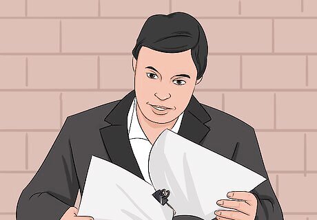
Study the script. The script is the most important part of a movie. It has information about the story, characters, plot and all the things that will happen in the movie. Studying the script thoroughly will you give you an idea about how the set should look. Take detailed notes on the script, making a list of the following: The setting. This includes the time period, geography, and ambiance. Crucial background props. What props are named in the script? What parts of the scene do the character need to interact with (a TV, an oven, the blinds, etc.)? The mood of the script. Comedic and light? Dark and serious? Somewhere in between? This will profoundly impact your color choices. How many characters will need to fit into the space. If it is too big, the actors can be swallowed by the space, but if it is too small it will be awkward to film in. Remember, you can also use space size as a stylistic or symbolic element. Will the location need to be designed from the ground up (like a spaceship) or can they be adapted from pre-set locations, such as a house?

Ask the director about any plans, themes, or necessary props he/she wants to be incorporated. You must remember that, above all, you are there to contribute to the director's vision for the movie. They may give you some pointers, or they may give you free reign to do what you want. Some directors, like Wes Anderson (Grand Budapest Hotel, Rushmore), have detailed and meticulous approaches to set design. Other just want an unobtrusive, natural looking environment. You should ask about: Any tone, mood, or theme he/she wants to keep. Any color palettes that should remain consistent. The movie The Fall, for example, uses deep, contrasting primary colors to distinguish its locations and characters. The budget. How much money do you have on props and set decoration? Extra props/furniture. Is there anything the character uses that isn't in the script?

Sketch a mock-up of the set design. There is a variety of ways to do this, but your basic goal is the same: show the director the "set" before you spend a dime. The most common professional way to do this is through "sketch-up," which is an architectural drawing of the scene, like this one for "Good Night, and Good Luck." This, however, takes a lot of time, and may be counterproductive for smaller movies. You can also try: Photography. Create a small book of photos of props, locations, and rooms found online or in real life, then talk to the director about ways to redesign the rooms in the photos to fit the movie. You can also cut and paste photos together. Drawing. Simply sketch out the rooms on pencil and paper. You usually want a top down view of the set, listing all furniture, walls, doors, and windows, and a more artistic, cinematic drawing of the room. Other films. Pull up clips and shots from other movies you might want to emulate, then discuss how you'd change things to make them unique. Showing the director other movies can give a sense of how set design impacts the final film.
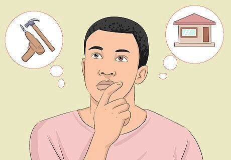
Decide if you're going to build the set or use an existing location. There are pros and cons to both strategies, and you may use both existing locations and pre-built sets on the same movie. This is the most crucial decision you'll make when designing a movie set, as it will wildly affect the budget, scene, and filmmaking process. This decision is almost always made with the director. Building a Set: This gives you full control over the set design. Usually, you build a 3-walled room, like a theater stage, then stock it will all of your props and designs. The camera crew then uses the space of the missing 4th wall to film. While the creative freedom is great, set building is expensive and takes a lot of time to get right. Shooting on Location: This is when you adapt a pre-existing location into a set. It is cheaper and faster, than set building, but comes with its own concerns. You must be sure you have permission to shoot there, and that the set won't be altered or adapted while you're not filming. You also need to be sure that actors, cameras, lights, and sound equipment can all fit, and you can make any changes necessary for the film.
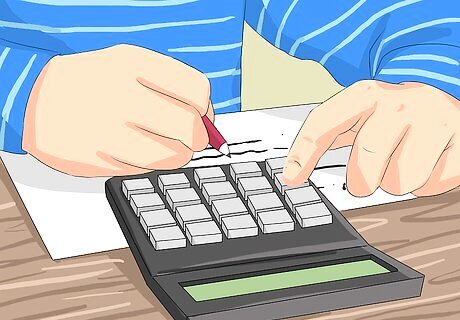
Draft a budget for your set design. Though budgeting is usually the least fun part the whole process, it is an essential skill for everyone involved in filmmaking. You do not want to be halfway through a set or movie and realize you've run out of money for an essential prop, and the only way to avoid this is to budget. Go online to check out prices of essential props and think about which ones you can make yourself. Make sure you've called and checked if there are any fees to use existing locations as well.
Set Designing
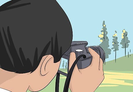
Go location scouting. Grab a nice camera and hit the road. Try and get 2-3 set options for each scene you have to design. Take shots of every single angle of the room, using as much lighting as you possibly can, so that the director knows exactly what the space looks like. On the way take pictures of furniture, decorations, or props that you think are a good fit in the set. Other things to jot down include: The dimensions of the space. Whenever possible, make accurate measurements with a tape measure-- there is a lot of film equipment you'll need to fit in the set. Any fees or stipulations for the set. For example, you might be able to shoot in a public school classroom during the summer, but it will be nearly impossible to film in fall when all the students are back. What are the power capabilities of the set? You need to plug a lot of things in to make a movie. Hows the ambient sound? Will people be walking through the set, and is that okay for the script?
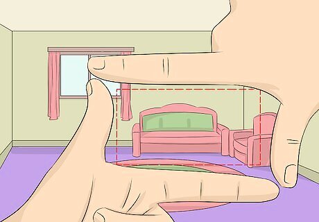
Discuss what parts of the room you want to use. In most cases you will need to design 2-3 walls, such as the ones behind two chatting characters. However, if the director wants to use the entire room for filming then you need to be sure that the entire set looks like it could be in a movie. Where are the characters moving through the set? This is called blocking, and you should push the director to make a decision now so that you aren't redesigning the set on the fly when shooting starts.
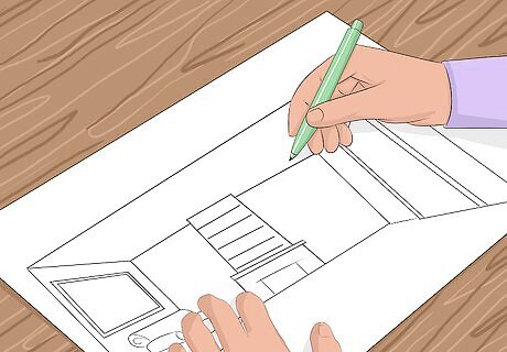
Think of the room's "lines" when designing. Lines create the illusion of movement for the audience, which makes a set design dramatic and engaging. Line is everywhere -- the tops of couches, the floorboards, the horizon-- so don't interpret this as pinstripes. Remember that a set is a 3D space, but the audience perceives it as a 2D space, like a photograph. Thinking of your set like you were composing a photograph will always lead to more interesting designs. How can you get the illusion of depth in your set? What lines of perspective, furniture, and decorations will lead the eye to the most important prop/character in the scene?
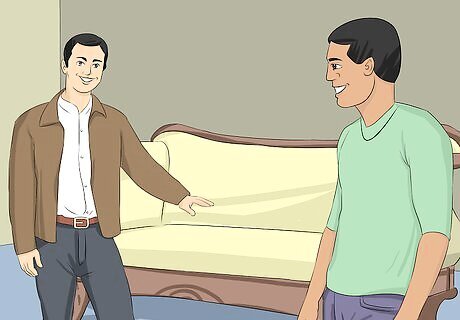
Build, design, or buy essential crafts and props. There are hundreds of DIY solutions to set design, but these take time. You need to use your budget to balance the speed of buying everything with the creative control of building the whole set. Your design needs will change from set to set, but there are some key principles to keep in mind: How essential is a prop to a shot? If it is just a piece of background material you can often get away with a cheap, quick prop, as it will likely be blurred out anyway. Posters may help decorate a room, but they can also look cheap. Buying several inexpensive poster frames, however, can give the room a much more high-class feel. Make or buy one large centerpiece if you are on a budget. What is the focal point of the scene, and how can you make that as great a prop as possible? 90% of viewers will be focusing on that object the entire time, such as the couch two characters are sitting on.
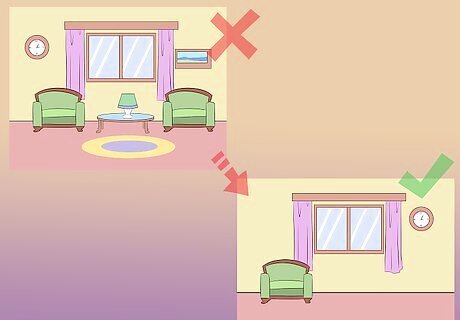
Remember that less is more. Unless the point of the scene is that things are cluttered and chaotic, less is more in the scene. You don't want the audience focusing on your set, you want them focusing on the actors and action. A great set is unobtrusive -- it feels natural and realistic, less like a set and more like a room you could visit in real life. While you can think of many extravagant, complex sets (The Royal Tenenbaums, The Great Gatsby, Blade Runner, etc.) these are not exceptions to the rule. Rather, the sets in these movies are made to fit a lush, extravagant, or chaotic script. Thus, they appear natural in the world of the movie.
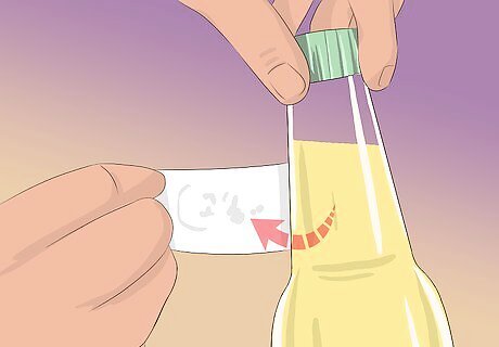
Remove or cover up any brand images. It actually costs money to show that "Kitchen-Aid" logo on the mixer in the corner. While it is unlikely that you'll get sued for anything, there is no need to take the risk. Whatever brand logos you can remove, cover up, or hide need to be covered up. This is done because a brand may not like how you use it in a movie. No toilet paper company, for example, want to see their product used by a serial killer to wipe up blood.
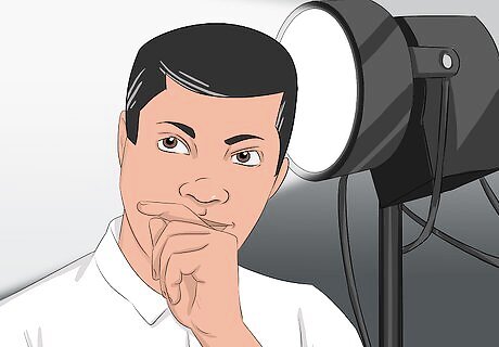
Light the set with the cinematographer. After lighting, there is a good chance you'll need to redesign the set a bit to eliminate awkward shadows or fit in lighting stands. This is also a chance to put in any "practicals," which are lights that appear as part of the final movie, like lamps or ceiling lights. The cinematographer is also in charge of camera placement, meaning this is the time to work out crew placement and check how your scene looks at specific camera angles.
Building Flats (Fake Walls for Original Sets)
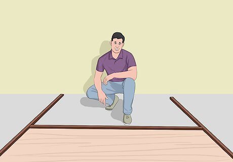
Build "flats" to make fake walls for any movie set. Flats are ubiquitous in set design, as they are the foundation of any hand-made set. Flats are always 4x8 feet large, and are quickly and easily decorated to look like a home or room. Though it takes some carpentry and tools, flats are actually pretty easy to build. To make one 4x8 foot flat, you will need: 1 4x8' sheet of Masonite. 5 pieces of 1"x3"x8' wood for the frame. 1 4x8' sheet of plywood for the jack, or base. Wood glue and a box of 1.5" nails.
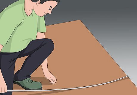
Lay your Masonite on the ground to measure out the frame. Put the piece of wood on the ground so that you can accurately measure out the size of your frame on its back. The frame will surround the edges of the Masonite, like a picture frame.
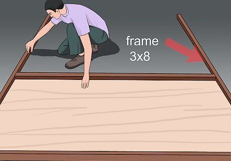
Place 2 of your 3x8 wood pieces along the long side of the wood. The 8-foot long wood should fit perfectly along the long sides of the Masonite. Make sure they are flush with the edges and that the thin side (1" thick) is the one touching the Masonite.
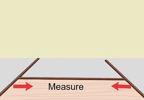
Measure the distance between the two long pieces of wood. The smaller end needs to go inside the longer pieces, so you'll have to cut one plank of wood roughly in half to make the frame. If you used 1-inch thick wood, the two shorter sides should be cut to 46-inches long, since the wood is 4 feet (1.2 m) wide, minus an inch for the width of the long planks on the edges. Still, you should make this measurement before cutting to double check.
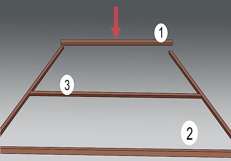
Lay your two cut planks along the top and bottom edge of the Masonite. The entire outside edge of the wood sheet should be framed by your wooden planks, with the two shorter sides tucked inside the longer 8-foot planks. Cut a third piece to this exact length as well and fit it into the middle. The whole frame It will resemble a classic two-part window frame when you are done.
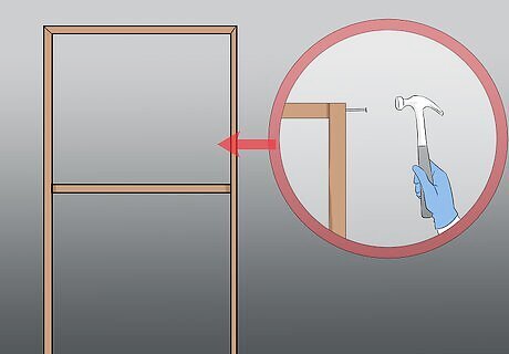
Hammer your frame together using 1.5" nails. Simply put a nail into every joint. You will be doing more work later to hold it together, so these 6 nails (2 for each horizontal slat) should be fine to start.
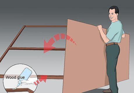
Apply wood glue to the entire frame and press the Masonite onto it. You don't need too much, as you'll be using nails as well. Have a friend help make sure that the edges of the Masonite are flush with the frame.
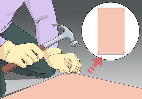
Nail the entire Masonite Board into the frame. Start with the four corners, then put as many nails as possible into the board to attach it to the frame.
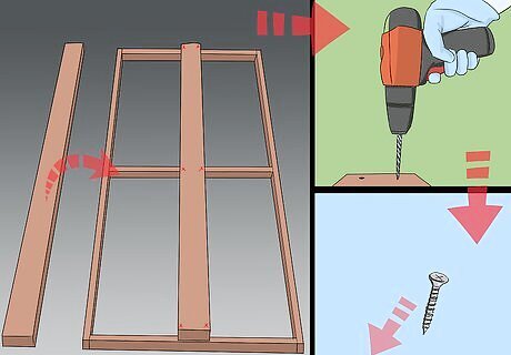
Attach your final 3x8' piece of wood into the back of the frame, on the center. Lay the piece down so that the wide side is flat in the center of the frame, then use a power drill to put pilot holes into the frame and wood piece. Use long wood screws to attach the wood to the frame. The result will be one long piece down the back of the frame, almost like a wooden pallet. Use two screws along each horizontal wooden part of the frame. This long piece in the center attaches your flat to the stand that will hold it up.
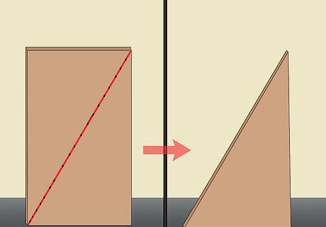
Cut your plywood in half diagonally. This is your stand. It will act like the stand on the back of a picture frame, holding your flat up so that it doesn't fall.
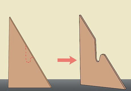
Cut a one-foot notch in the center of your plywood's hypotenuse. The hypotenuse is the longest side of the triangle. Cut a rounded notch into the center of this side, cutting down roughly a foot or so. This notch is where you can drape a sandbag or weight to hold the flat down.
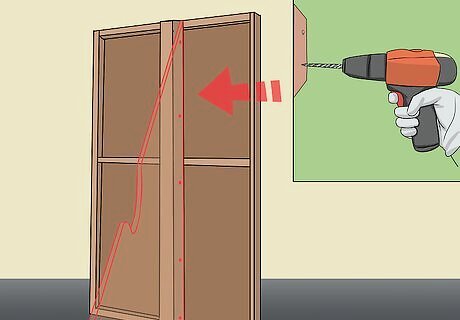
Use a power drill to screw the plywood into the frame. Attach the plywood on either side of the wooden board running down the middle of the frame. Remember, your goal is to use the plywood like the back of picture frame, helping the flat stand on its own. Again, drill pilot holes into the plywood and frame, then use wood screws to adhere the two together. 6-8 evenly spaced screws should work fine. To make it easier to work, you can also use wood glue along the edge of the board before attaching the screws.
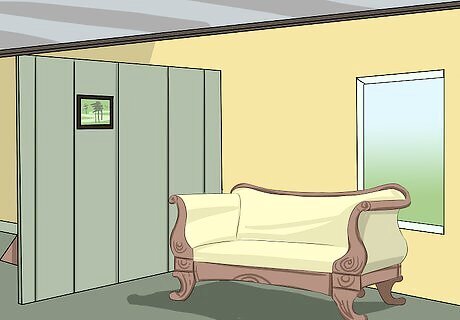
Use the flats to create the walls of your set, then begin decorating. You'll have a lot to do, painting the walls to bringing in furniture, accents, and lights, but this is the best way to have full control of your set design.






Comments
0 comment